DESIGN FOR WEB . USER RESEARCH . USER EXPERIENCE . VISUAL DESIGN

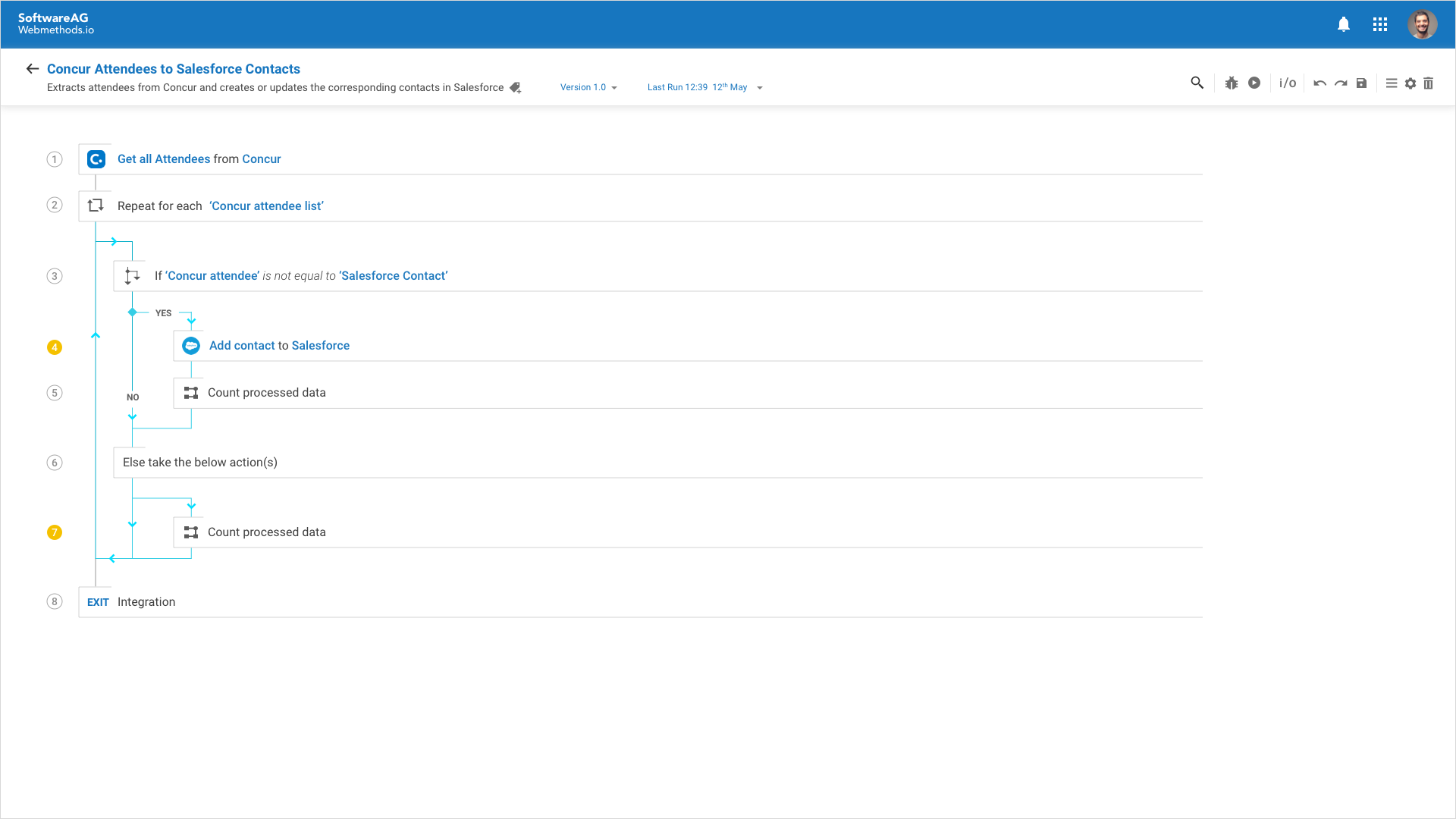
Visualization of Concur and Salesforce applications' integration.

The Problem
The webMethods integration platform offers a wide variety of tools and methods for creating custom logic and integrations. However, this can lead to confusion because the process for creating custom logic differs significantly between on-premise and cloud deployments. Additionally, the platform's tools can be complex, with an unintuitive user experience, inconsistent usability, and outdated and inconsistent visual design elements.
Developing a unified approach to integration creation across all Software AG's iPaaS tools.
Target Users
Developers using the FlowService tool are expected to have basic programming fundamentals and backend functional knowledge. The tool caters to a range of expertise, from those creating an integration for the first time ("newbies") to integration specialists.
My role
Co-created core user experience and features with development, product, partners, and designers.
Led user research: Moderated workshops with stakeholders, conducted user interviews, and facilitated usability testing.
Contributed to product knowledge: Analyzed user journeys, identified pain points through research, and participated in competitive analysis.
Defined visual design direction: Created UI mockups and comprehensive style guides for implementation.
Ensured usability: Conducted a pre-release UX audit using the NIPC model (Navigation, Interaction, Presentation, Content).
Core team and stakeholders structure
Designers - Team of 2(including myself)  |  Product management - Team of 6  |  Development - Team of 15  and various other engineering and product team members.
Product Vision
How can we empower users to create advanced logic and integrations in a simpler and more efficient way to boost productivity? 
Design approach

Research & Collaboration
Part 01
Knowledge mapping
Kick-off knowledge-sharing sessions with domain experts clarified core concepts like "what, why, and how" of application integration within the webMethods Integration product ecosystem. These discussions also identified fundamental product needs, user behavior, and usability issues in existing solutions.

User journey mapping
Leveraging knowledge mapping insights, we mapped the user journey, outlining the key stages users follow to achieve their goals. This high-level journey was validated with stakeholders to ensure accuracy.

High-level user journey of FlowService tool and what user would appreciate/benefit at each stage.

Competitor & Comparer analysis
Leveraging our internal UX toolbox's competitor analysis template, we assessed competitor and existing integration tools' UX/UI strengths and weaknesses, specifically focusing on the creation stage. This exercise helped us identify our USPs, differentiators, and opportunities in a clear and actionable format.

The list of competitors and comparers(Software AG's integration tools) we analyzed.

Core UX values
Our research identified the following UX principles to guide FlowService design.​​​​​​​

Core UX values of FlowService.

Problem canvas & Collaboration model
Until now, the collaboration between the product team's architects, developers, and experts led us to identify and understand the problem, validate the user journey, know-how on application integration building blocks. But, how might we solve this problem collaboratively without focussing on just the features we need in FlowService? This informed us about the resources/team clarity we need to solve the problem. To communicate the same with the stakeholders, we created the problem canvas to better structure the problem and the resource requirements.

FlowService Problem canvas (post the initial research phase).

Part 02
Partner/User research
We discovered the chance to speak to end users via one of our partners during the early diverge phase. The first step was to speak to the partner who is going to be present in the field for the interviews, he is an integration architect/developer with 7+ years of experience. Along with the in-house enterprise Architect from the webMethods team, he helped us screen the users for 1:1 interviews. 
We interviewed 6 end users with varied years of experience in creating integrations. We had to improvise the questions based on how the interview was progressing with the users. This led to the discovery of how the partner ecosystem functions and the tool evaluation process, based on which their clients rely to invest.
Goals of the research

Top goals of the Partner research

Who are the users?

A brief overview of the 6 end users we interviewed 1:1(users were not comfortable enclosing their names/ taking their pictures/ recording the session. So I illustrated to best represent them using Thoka Maer illustrations in the interest of time).  

Comment from the experienced Integration specialist during the 1:1 interview.

Research Outcome - Opportunities and actionable insights

Outcomes derived from the user research.
Ideation and Iteration
Part 01
Idea generation
Based on all the inputs and insights gathered from the study and research done so far, we started to sketch a few sets of ideas. To better visualize the new ideas, we used an existing recipe use case from the bank of 'integrations recipes' available in the existing tool to understand the details of the user journey and validate the idea with the stakeholders.
User starts typing in simple english to start creating integration.
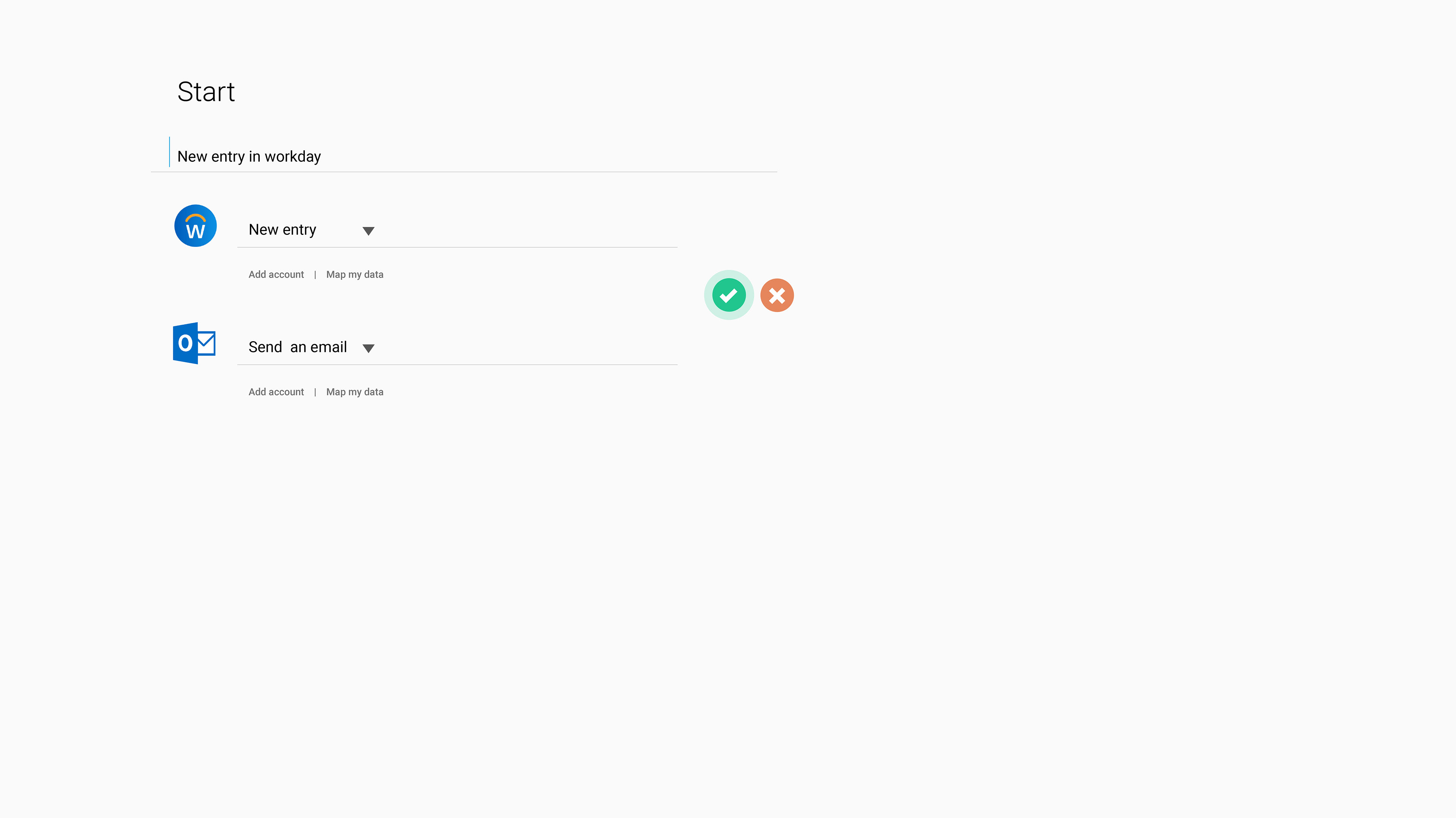
once the user types, system recognizes and translates the visual format and user can confirm whether it is good to go or not
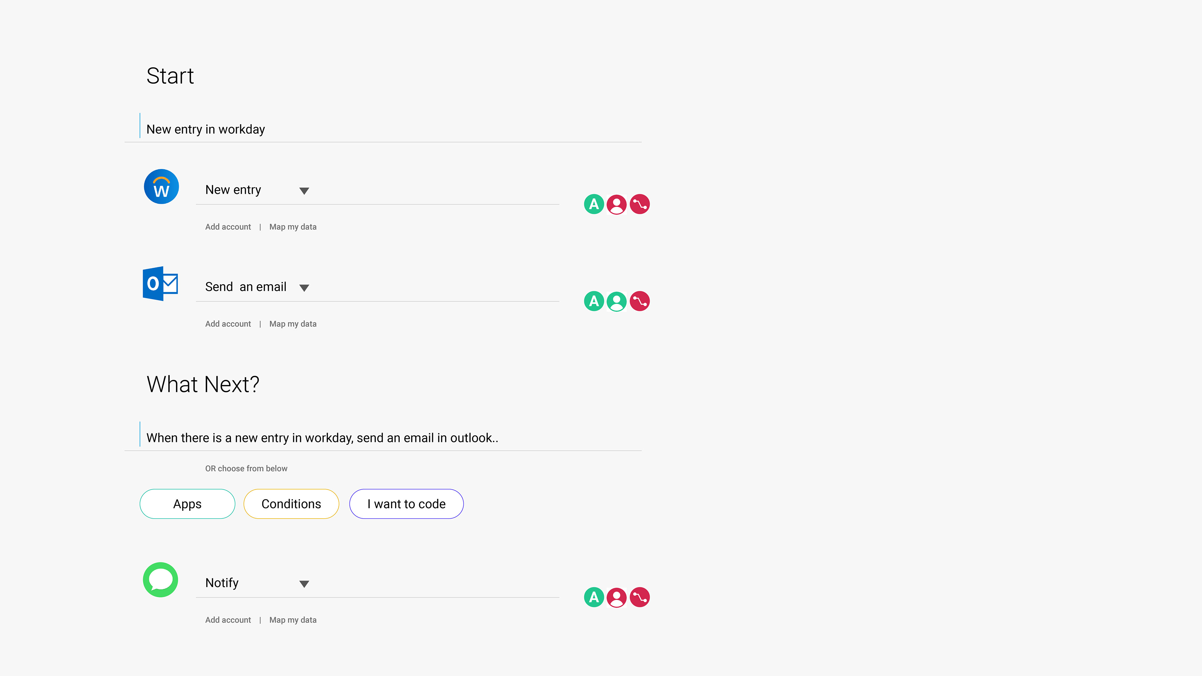
once the user confirms, system asks for next steps. User types in and system auto populates & translates the statement.
Digital wireframe of the idea that has been inspired from a humanization aspect, using Natural Language Processing(NLP) for integration creation (please hover on each image of the photo grid to read the respective description or click to view the detailed screen).​​​​​​​
NLP concept-based ideas didn’t go ahead due to major technical challenges. But, we identified the key integration building blocks through this validation. Also, from the observation of how developers code, a top to bottom approach and the code is set in lines by numbering for easy reference led to the idea of the reimagined lines as ‘steps’. This approach also helps in retaining the familiarity aspect for the users.
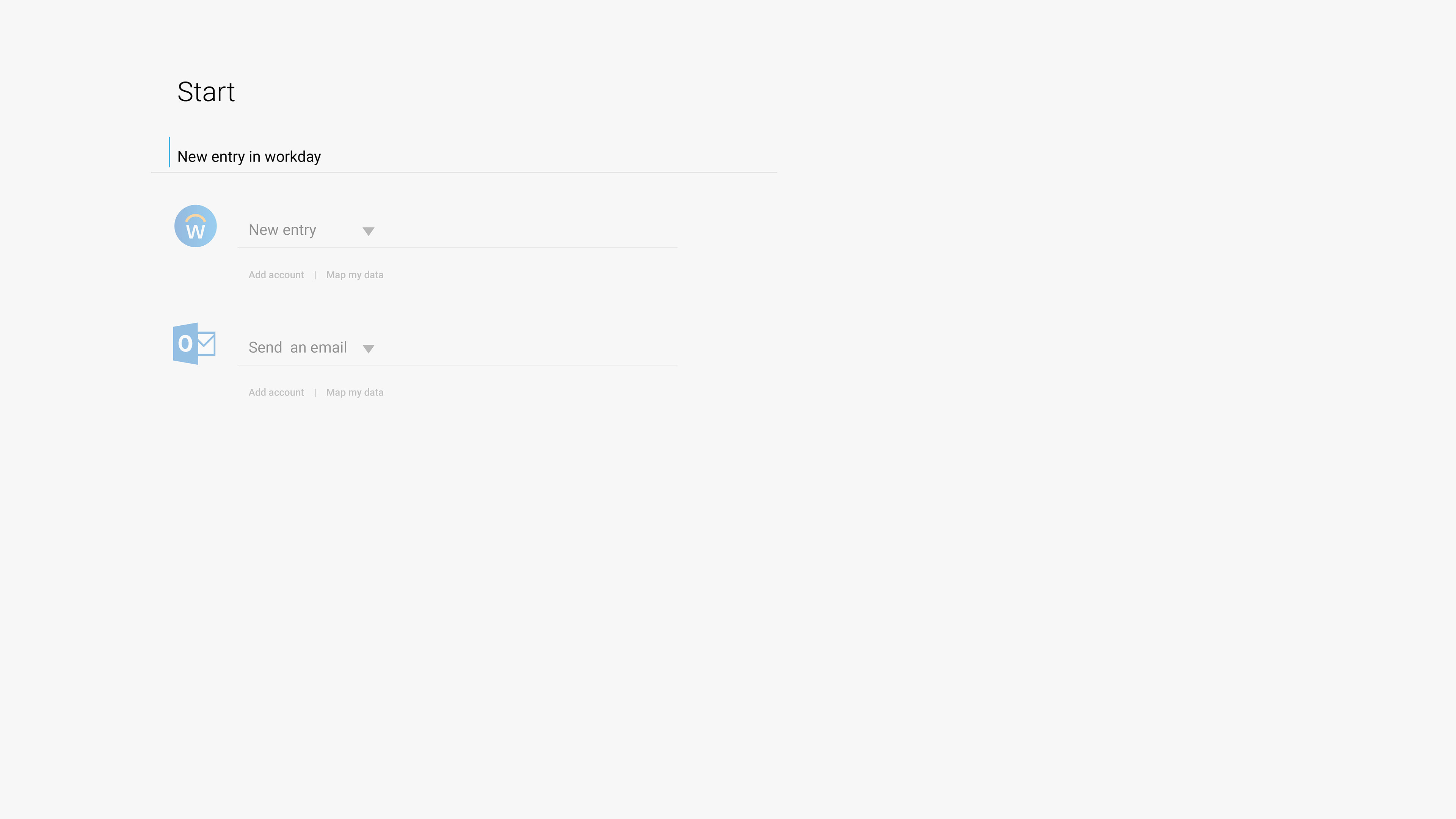
Wireframes of step creation - search component exploration → Access to Apps/constructs/services/integrations.
Wireframes for defining step states and suggestions for the user when in an active state of the step.
Validation
We then created low-fidelity mockups of the user flow and showcased it to 5 internal users, Sr architects, and integration developers. The design review then led to uncovering major capabilities of the 'Explore, Create, and Test' stages:
• Tool migration → EXPLORE
• Constructs usage → CREATE
• Data mapping → CREATE
• Debugging → TEST

and from the design standpoint;
• Workflow of the user: ease of use.
• Efficiency of time in creating the integration using this approach.
• Accessibility: How can the user create integration by just using a keyboard?
• Onboarding the user.
• Using the design system library.
• Need of testing the tool from the visual design perspective.

Based on the inputs, an internal demo was done using a low-fid prototype with new design changes to identify the gaps in the user journey and flows.

Visual design exploration of the integration creation → step structure. Showcased the UI at the end of the demo to gather first look feedback.
Post the demo, the action plan is to co-create and collaborate with the development team to build the first version of the tool and to test the same in an upcoming International User Group (IUG) event.
Part 02
Design sprints
Before the beginning of every design sprint, the list of functionalities, scoping & prioritization were in place for better design-dev collaboration. With every sprint demo, the FlowService tool evolved with the improvements in design based on the reviews, inputs, and feedback shared.
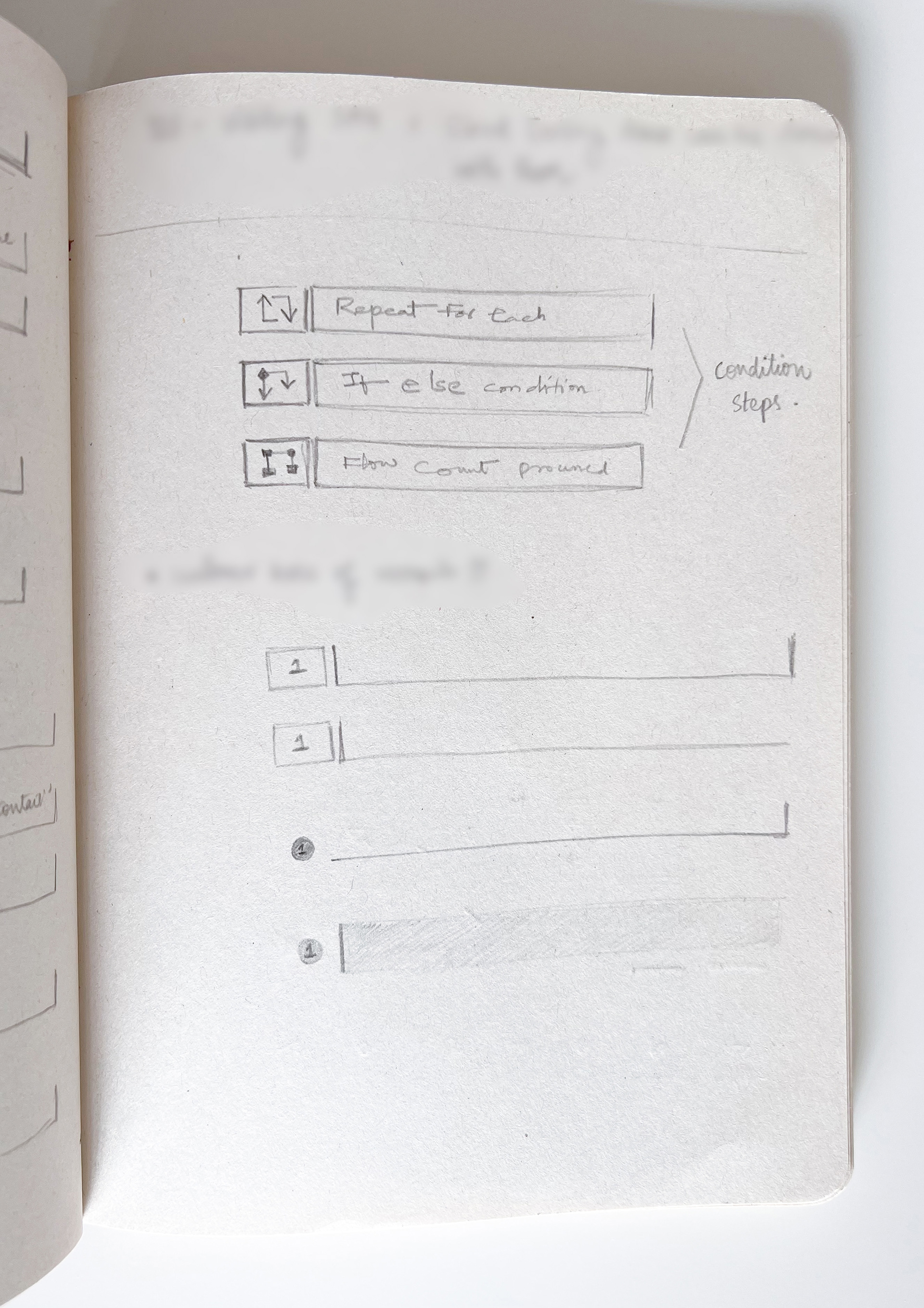
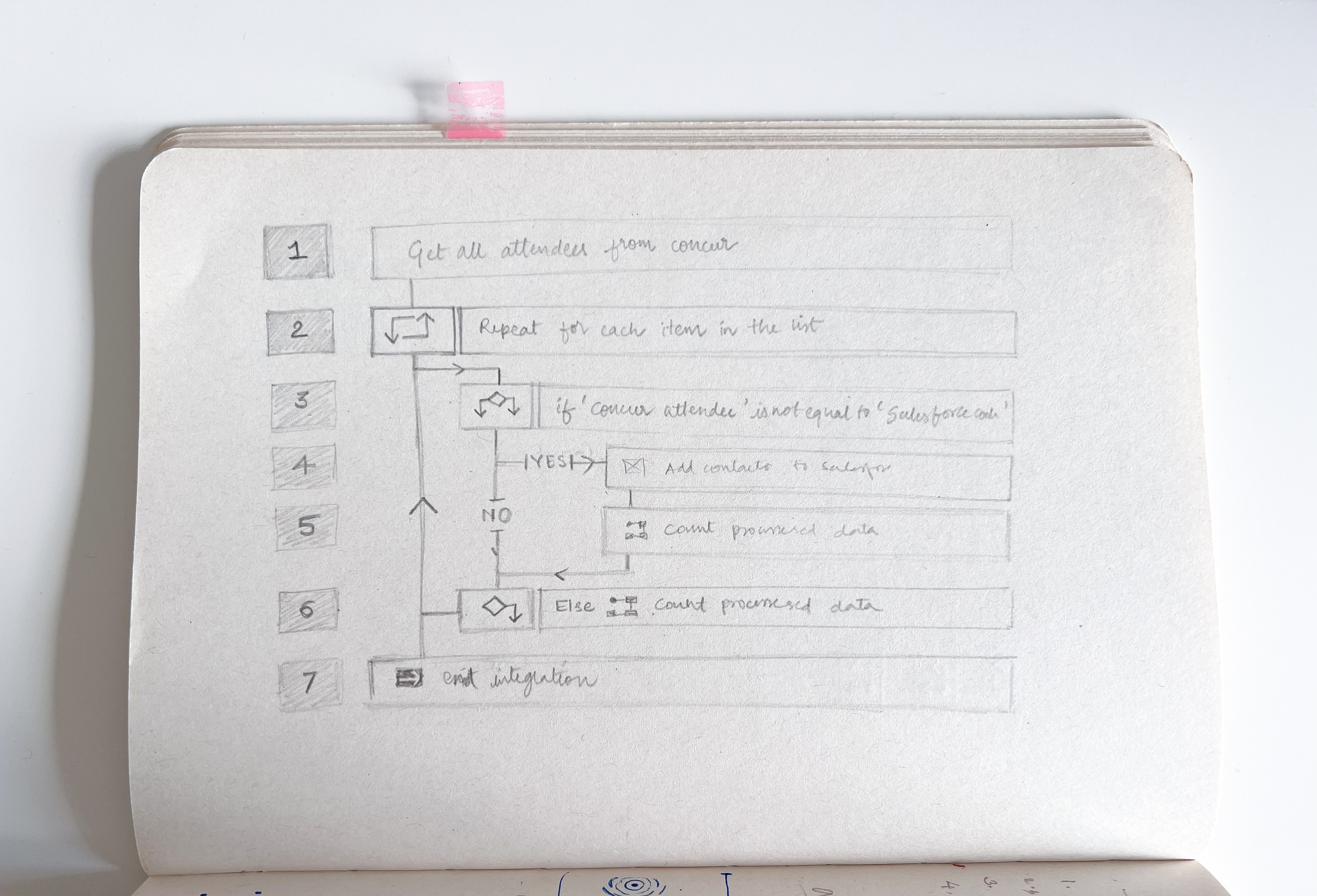
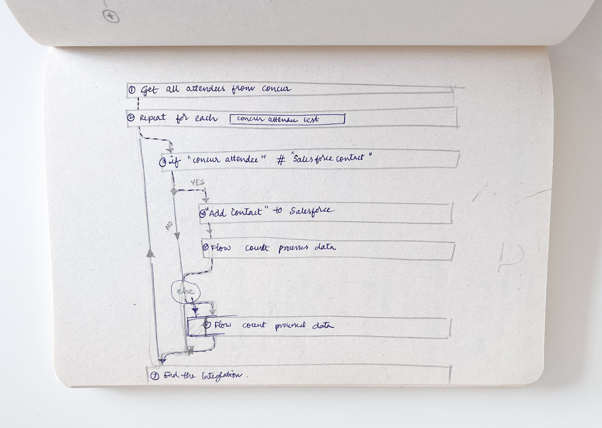
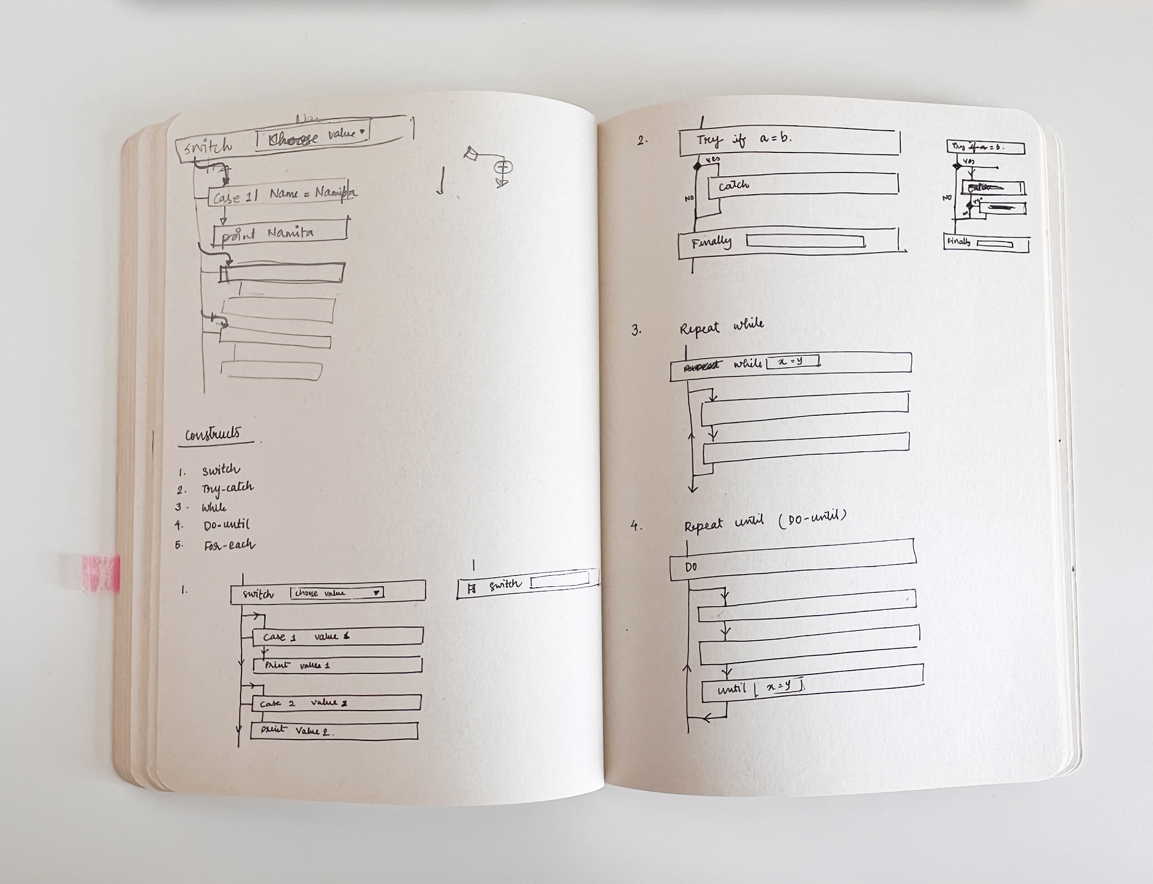
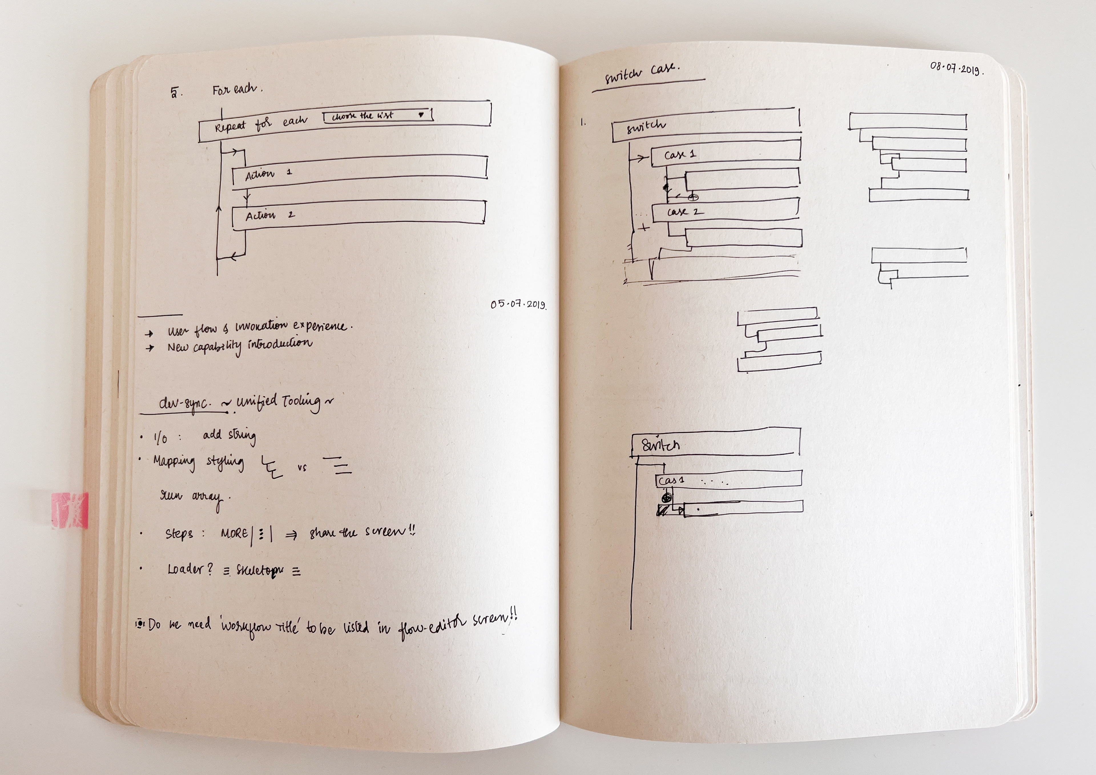
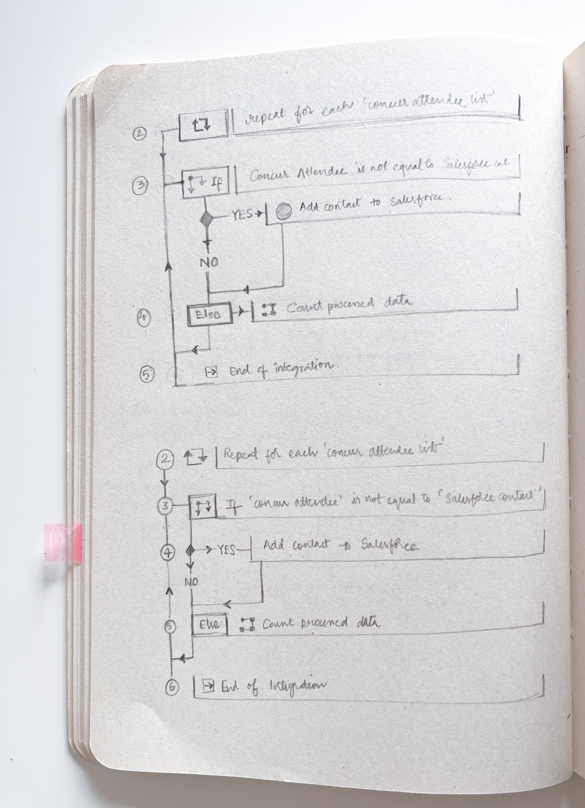
Steps structure exploration sketches.
Visual explorations of constructs after the KT from developers.

The first version of the visual design of the FlowService tool after several refinements in steps/step states/access to accounts & mapping/step suggestions, constructs, and global actions.
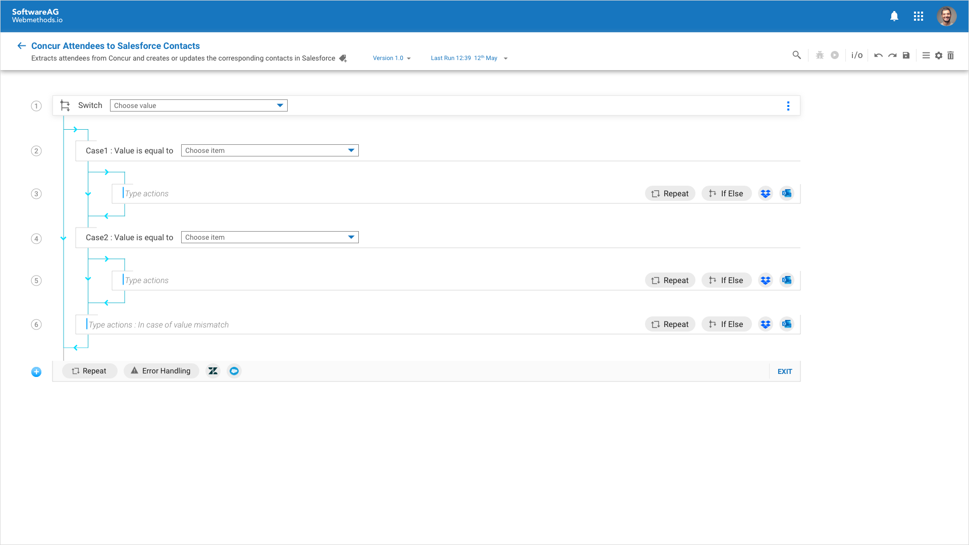
Switch case construct visualization
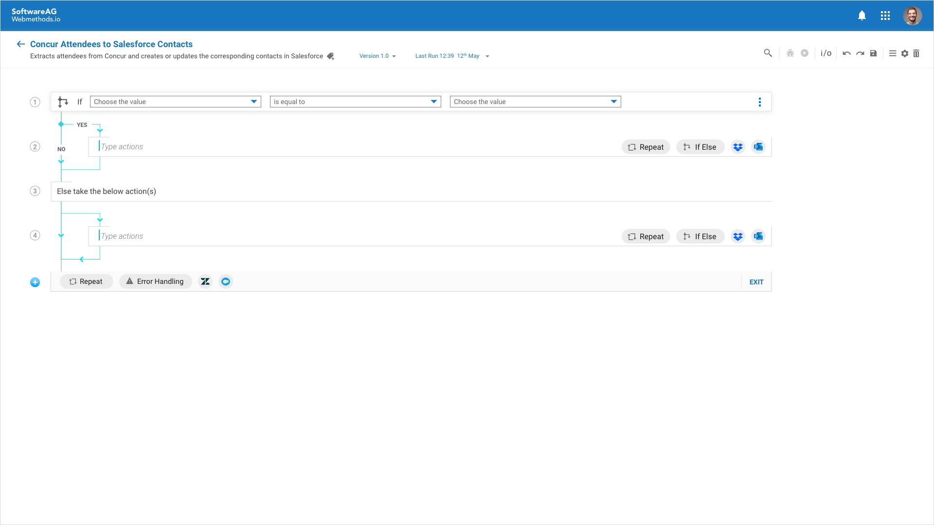
If-Else construct visualization
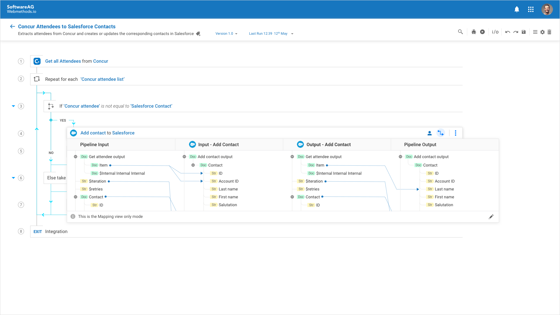
Data mapper - Mini view at the step level
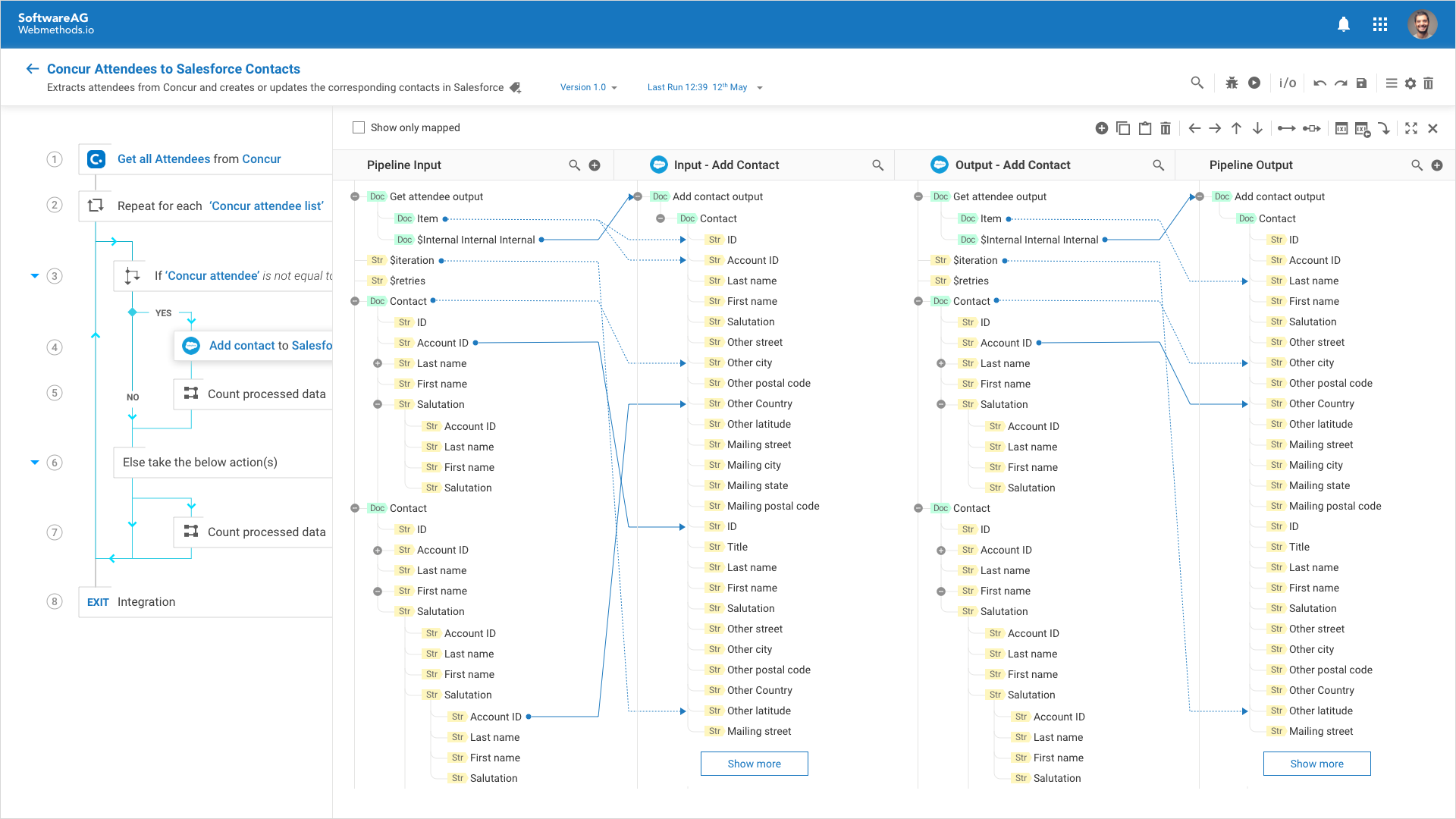
Data mapper - Edit mode
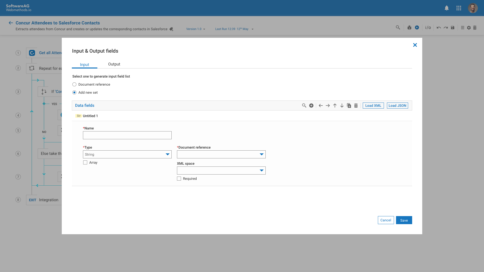
Defining Input and Output data values before running the integration.
Adding breakpoints at the step level before debugging
Error states at step level and visualization of error state in Navigator panel
Seen here is the UI of the key screens at the CREATION & TEST/MODIFY user journey stages (please hover on each image of the photo grid to read the respective description or click to view the detailed screen)
Usability testing
At the end of the first sprint, *we conducted think-aloud 1:1 sessions with 11 users during the International User Group(IUG) conference. For this UT, we used a simple click-through prototype intending to showcase the user flow and some key features to identify the issues concerning visual design, findability, and workability and to discover new findings/business needs.
*I was not physically present during these UT sessions but supported with the pre and post-UT sessions preparation in terms of script, prototype, and the results report.​​​​​​​
A use case is presented with certain tasks/questions around it to let users think aloud while performing the tasks and share what works or doesn't work for them.

Shown here are a few of the tasks/questions presented to the users based on the use case, to test the concept at the 'creation' and 'test' user journey stages.

Overview of User backgrounds & profiles.

Example showing how Usability testing responses were recorded regarding the first impressions and home screen of FlowService.

Cumulative feedback about the product from the users. Image credits Atlassian worklife. 

Refinements
Based on the collective feedback from the users, the priority was to address critical issues, have feasibility discussions with the dev team, and create a backlog. Also, focus on the design changes for an enhanced experience by co-creating and collaborating with the dev team. With all the necessary changes/modifications in place, the next step is to re-test with a more diverse set of users.   

FlowService UI after UT feedback and after undergoing nearly 8 versions of changes/modifications.

Documentation
Whether it is migrating existing customers onto the new tool or helping novice users to understand and use the new tool, onboarding is a crucial step of the user journey. Even though the user is guided with the help of onboarding for their First Time Usage (FTU), we ensured the need for detailed documentation of all the components/features by defining and describing the behavior of each one of those (this also came from one of the insights derived during the user interviews with partners) at one place under the 'help ⍰' section of the tool. We created an end-to-end workflow of the tool in the form of a clickable prototype and gave a walkthrough to the documentation team to make them well aware of all the capabilities/functionalities to refer to in creating the detailed documentation/help section.
Part 03
Unification journey
FlowService tool evolved with each sprint, reviews & feedback. But, the major challenge ahead of us is providing a cohesive experience of webMethods.io Integration to the customers by the seamless integration of the FlowService tool with one of the existing tools called Workflow (a tool for business users to build integrations faster). This led to a focus on the invocation experience of FlowService and the end-to-end user journey.
To understand the challenge further, product teams, designers, and other stakeholders came together for the unification workshop. The outcome of the workshop resulted in understanding the two different sets of personas and their tool usage, and common functionalities, achieving design language system consistency across both the tools.
Invocation experience
End-to-end journey and FlowService tool invocation proposals have been shared based on the unified experience strategy workshop results. The proposal consists of the redefined home page of webMethods.io Integration where users can choose the tool based on their preference. We then received feedback from product management and other stakeholders to not give the user the tool choice but seamlessly integrate the FlowService tool into Workflow.
We came up with 2 approaches, direct invocation, and indirect invocation via Workflow canvas. 

Direct invocation approach based on user's choice.

Access to FlowService from Workflow canvas.

To test the invocation experience of FlowService, we conducted focused group discussions using the A/B testing method with 10 participants (System Engineers and Product Managers) using 2 approaches; Direct & Indirect invocation and only Indirect invocation. The objective of the feedback sessions is to define the right way to invoke FlowService within webMethods.io integration.

Insights derived from the feedback we received from the System Managers and Product Managers.

Based on the feedback results and the insights derived, we gathered that 
• Workflow & Flow need to co-exist seamlessly, 
• Selling story needs to fulfill both demo perspective and user need of achieving complex use cases.
• Experience consistency as a top priority
Upon the internal discussions with the stakeholders, the next steps were
• To define the story as per an end-user need and not what just looks good.
• Differentiate the tools based on roles/expertise level.
• Experience consistency.
• Testing the changes with the end-user.

This is how the webmethods.io Integration home page functions now, with access to both Workflow and FlowService within projects and also invocation of FlowService from Workflow canvas.

UX/UI review
Before code-freeze, the development team is in full swing to resolve the issues from the bug bash. As a UX/UI designer, I expect the result to be free from UX/UI bugs. At this stage we both designers rolled our sleeves to make our UX/UI bug bash with a focus on resolving Navigation, Interaction, Presentation, and Content related issues(even though we did design reviews at the end of each sprint). 
We identified more than 200 such issues concerning to FlowService and encouraged other developers(internal users) to contribute to the list. To have transparency in place, we created iTracs for each functionality cluster and assigned them to the respective developer, and tracked them until the issue is checked under the resolved column.

Review template and legend created for UX/UI bug bash

The Impact
FlowService tool went live in the US and EU data centers in June 2020. 
Software AG named as LEADER by FORRESTER WAVE in the Enterprise iPaaS space in their Q4 2021 report.

Comment from one of the webMethods Designer users after experiencing the new FlowService tool.

My Learnings
Collaboration is key: There was never a day I was working in silos during the FlowService project. For every line drawn, the icon made, and the component designed there was continuous validation and understanding of the why behind a lot of decisions. This not only helped me better understand the requirements but building a great rapport and relationship with the development team.
Visuals speak louder than words: Working with the engineering-driven teams taught me how a simple sketch or visual would create such a difference in communicating the concepts. This especially helped when shaping the ideas in the form of visuals and communicating with the developers, and product managers.
Design evangelism & using the Design system: With the acquisition of the built.io company and the need to integrate FlowService & Workflow(built.io integration tool) resulted in many challenges, especially in terms of product UI and unification journey. Advocating the usage of DLS by evaluating and embracing the differences in both experiences made the cross-functional product teams understand the importance of having consistency and help integrate products much faster. Although, there were some compromises I had to make in terms of visual design due to certain business decisions made by the product management team.

MORE CASE STUDIES

Back to Top