Project duration: 8 months | Dec 2017- May 2018
Trend reporting, Ethnography, Storytelling, UI toolkit design

Image credits: Painting by visual artist Sameer Kulavoor

Why trend research?
After a detailed dissection of competitor mobile UI/UX design and positioning Samsung in the mass segment, there was a need for creating visual inspiration and guidelines for Samsung phones that can connect with Indian millennials. This led to identifying what is the visual appetite of the users in-depth and creating delightful visual designs for localized digital experiences.
Adhering to my non-disclosure agreement to protect confidential information in this case study, I have limited sharing of the process and modified toolkit elements.
Target audience
Indian millennial mobile users, with the age bracket of 18-35yrs. They are the majority chunk of India's population(*34% approx. 440 million) and also the chief wage earners of the household(*70% of total household income). Some of the behavioral attributes of these users are spending over saving, desire to stand out, and value-driven where they do not define premium by the price tag.
*Data shared by the marketing team based on the year 2017 stats.
My role
I led the visual trend research project by working with an external research consultant and co-creating with in-house UI and motion designers to produce a UI toolkit. 
- Created a pitch proposal for the research project.
- Look out for the agencies/consultants and onboarding the chosen consultant.
- Co-creating on the research process, project roadmap, and timelines
- Field studies(3 super users and 2 experts at the tier 1 city).
Facilitated workshop and walkthrough of 'trend research report and outcomes' between the research consultant and internal stakeholders.
Reviewing reports and deliverables from the consultant.
- Co-created with UI & motion designers to produce a UI toolkit for one of the three design themes derived.
- Organized and set up the product display design of the 'design themes' in Samsung UX innovation studio.   
Core team and stakeholders structure
Project lead - myself  |  External research Consultant(team of 6 and various artists & Illustrators)  |  UX researcher, UI and Motion designers(Samsung Design Delhi UX team) - Team of 9
Project Goal
The goal is to identify visual design directions/themes that appeal to Indian millennials.
Project overview
4 major phases of the Visual trend research project.
Research methods & processes
Phase 01
Trend research method
The method we used was trend-reporting, with a focus specifically on the visual landscape of India. This consists of the ongoing socio-cultural shift in India, everything from government initiatives to brand and cleanse the public space, to developments in Indian cinema and storytelling. The core of the research uncovered the narrative branding around the identity of India as a global economic superpower, a health-conscious nation, and a nation with a glorious past.

Example of how a sub-story is created.

Visual mapping
We identified key influencers that are shaping the visual preferences of Indian millennials. Mapping these visual influencers' imagery helped to create patterns from which strong trends emerged and could be used as inspiration for UI design.

Key influencers shaping visual preferences of Indian youth.

Key takeaways from the Visual Mapping
- Visual preferences of Indian youth are segmented into an entry, mid, and premium segment markets
- Visual metaphors should be locally inspired
- Local metaphors on global products are liked and appreciated
- Indian youth is attracted to bold and vivid visuals
- Craft and intricate work is considered premium
Phase 02
Field study
We screened 15 users to filter out 5 super users spanned across 3 cities in India (I have done the field study along with a research consultant for 3 super users in Delhi). In-depth interviews with five super users were conducted to distinguish visual preferences, and idiosyncratic habits of mobile device use for content creation, distribution, and consumption. This gave the context and flavor to the schematic visual UI themes created at the end of the research.
Top insights included the need for much more tailored, regional content.
Meet the Super users

Field study: 3 super users from Delhi.
(L-R) Picture 1: Superuser 1 at his home talking about one of his favorite poets' videos on YouTube.
Picture 2: Superuser 2 doing the card sorting activity in choosing the top 5 visuals from the given set of cards.
Picture 3: Superuser 3 at her home talking about her interest in deals and offers and often how she makes the most of these opportunities.

Card sorting activity: Top 5 Visuals chosen by the super users.

Picture from the field study of one of the super users' homes in Bangalore.

Expert interviews
We interviewed 16 experts across three cities(Delhi, Mumbai, and Bangalore) who have experience in public art, communication design, illustration, and UI/UX design, and working in the Indian market too helped shape some changes noticed in modern India.

Top comments from the expert interviews. 

How did we arrive at the Meta trends?
The trend report serves as a comprehensive guide to the visual and consumer landscape, it maps and tracks phenomena like product evolution and major shifts in buying behaviors and preferences. Scoping out these recent trends and developments helped us create 15 sub-stories. Sorting these sub-stories by grouping them into meaningful stories created predominant themes. 

Evolution of five Meta trends from sub-story mapping method.

Phase 03
User personas
The three contemporary user personas emerged from the five super user interviews conducted across three cities. We were able to draw these three personas based on their visual preferences, aspirations, and phone usage in terms of content creation, consumption, and distribution. These traits further informed us of unique mood boards with the help of visual mapping of the meta trends to their personalities and characteristics. 
3 User personas derived based on the India-Mass to Mid-mass to Global segments. Picture credits: Unsplash
Phase 04
Design themes
Three design themes/directions were distilled from five meta visual trends, meant to be inspirational for a localized mobile UI. These themes are comprised of unique mood boards in the form of videos, and imagery which give cues for color, motion, typography, and illustration style.

 Snippet from the trend research book by the research consultancy. © Samsung Design Delhi. All rights reserved

Theme 01
Unashamed, at times satirical, and almost always sentimental, very unique identity in a globalized world.

Design theme 01: Indian immodesty is aimed at India's mass user segment. Seen here are the keywords that best represent the design theme. Image credits: Illustration by Ranganath Krishnamani.

Theme 02
An escape from reality that is made possible by fantasy and imagination. Tapping into a spring of Indian mythical memory.

Design theme 02: Whimsical Heritage is aimed at India's mid-mass user segment. Seen here are the keywords that convey the design theme's essence. Image credits: 3D Art by Khyati Trehan for Samsung.

Theme 03
Inspired by the crafted, homespun and handmade inspirations of Indian art, architecture and lifestyle.

Design theme 03: Holistic Living is aimed at India's premium user segment. Seen here are the keywords that literally build up to the design theme. the. Image credits: A product of Nicobar (artist unknown).
Trend research outcomes​​​​​​​
UI Toolkits
• Having to translate research outcomes into something tangible is a great process to be part of. We presented the design themes to the UX team to explore and create the UI of a few key screens of some of Samsung's digital products.
•  The starting point is to provide the team with basic toolkit elements, such as key design principles, color, shape, and motion. 
•  The team split into three groups with 2-3 people in each to work on the three design themes. I led the Whimsical Heritage design theme, and we (2 UI and 1 motion) designers created 4 key screens, including iconography, illustrations, and transitions/micro-interactions wherever needed.
•  All the three groups worked on the same key screens but with different design theme toolkits to see the notable essence and difference between the themes. This was a fun collaboration between the UI and motion designers and an exercise to test our creative limits.
Below is a brief overview of toolkit elements, inspiration, and key screens' UI.
Note: Intentional blur done for the key screen UIs below due to confidentiality issues.
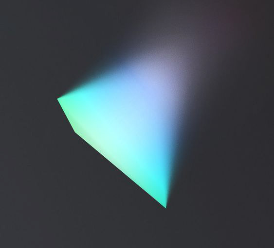
Design theme 01 - Indian Immodesty for mass mobile segment users
Dominant | Energetic | Playful
Visuals representing Key principles of the Indian Immodesty design theme.

Color, Iconography, and Key screen UIs based on the toolkit elements of the Indian Immodesty design theme.
Design theme 02 - Whimsical Heritage for Mid-mass mobile segment users
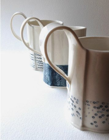
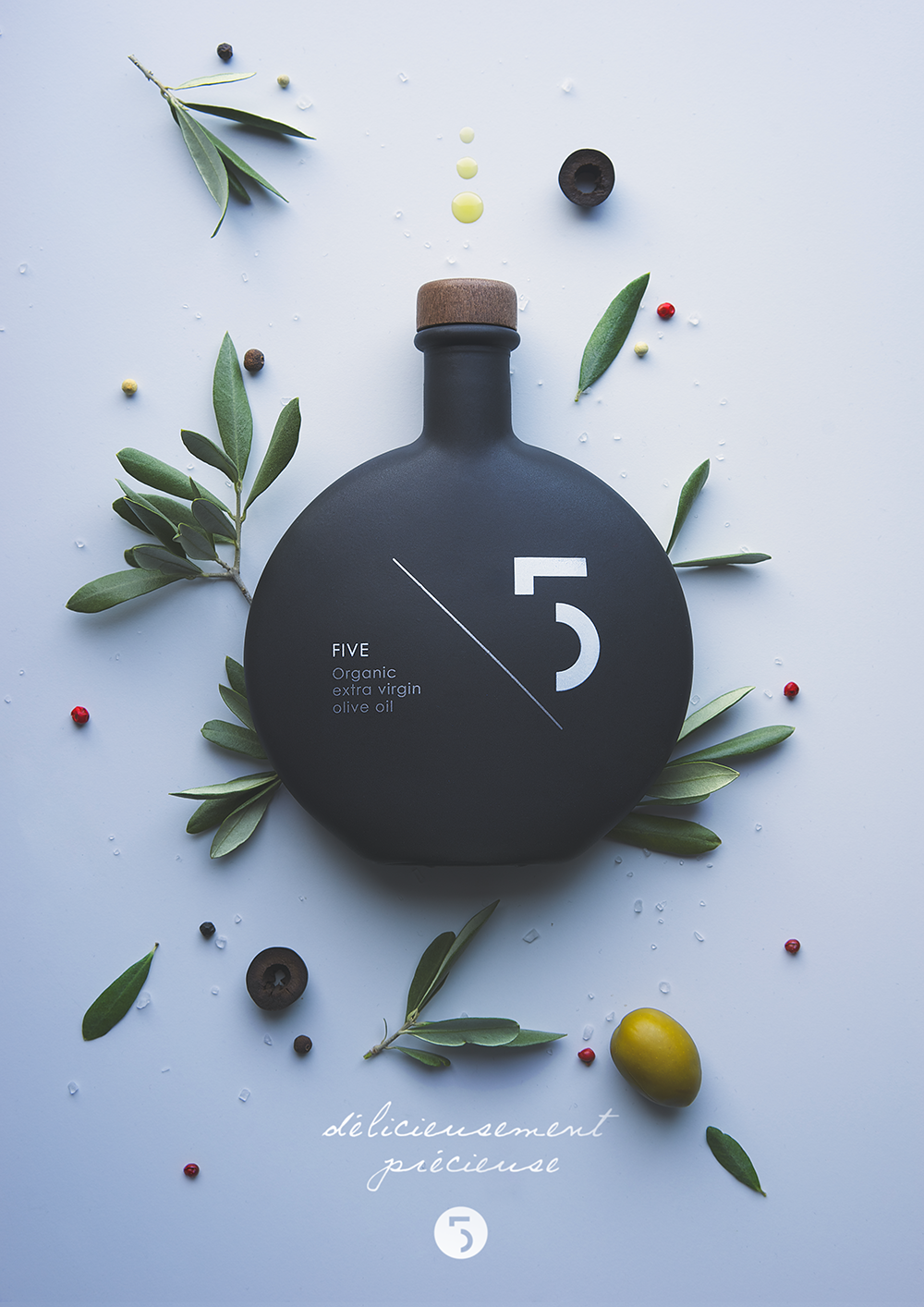
Prominent | Dreamy | Hypnotic
Visuals representing Key principles of the Whimsical Heritage design theme.

Color, Iconography, and Key screen UIs based on the toolkit elements of the Whimsical Heritage design theme.
Design theme 03 - Holistic Living for India-Global mobile segment users
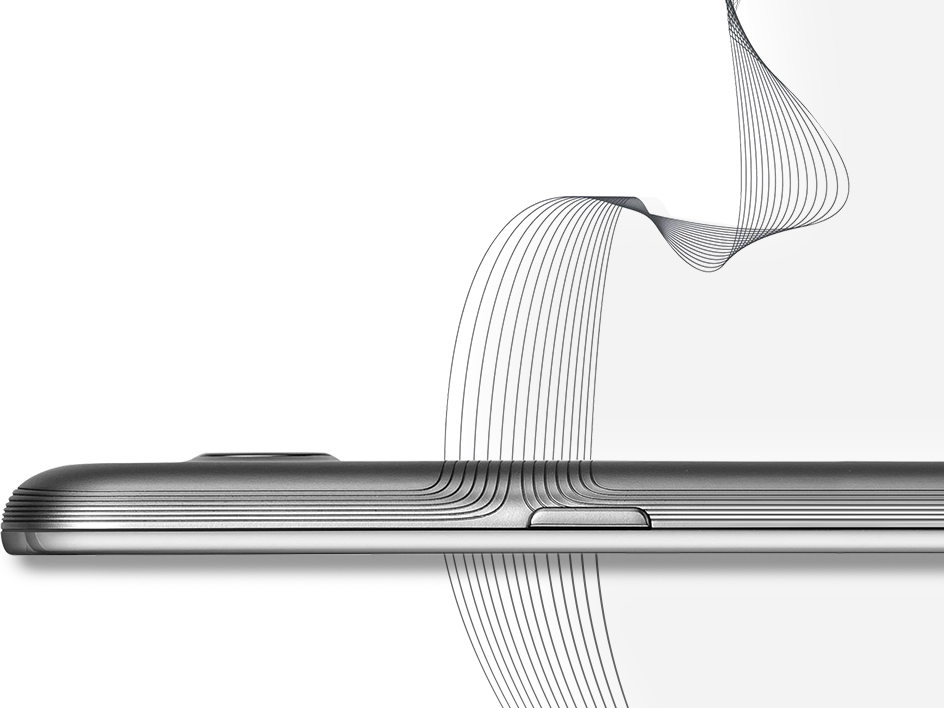
Soothing | Sophisticated | Minimal
Visuals representing Key principles of the Holistic Living design theme.

Color, Iconography, and Key screen UIs based on the toolkit elements of the Holistic Living design theme.
The Impact
Right after designing the UI toolkits derived from the visual trends, the color and icon style of one of the design themes is applied to the key UI screens of one of Samsung's digital products called Samsung mall. Also, these toolkits were instrumental in shaping the UI for Samsung's M series India mobile phones in terms of wallpaper design, iconography, and motion design.
Images borrowed from the Android play store for the Samsung Mall app (version 2.0) where Indian Immodesty color palette and Holistic Living icon style have been adopted in the application.
My Learnings & challenges
Trend forecast, How? : Whenever I come across trend reports like Graphic design trends of the year 2018 or UI/UX trends of the year 2019 and so on, I always wonder how one predicts/forecast a trend for future use. Onboarding an external consultant for trend research was my learning opportunity to find the answers. Knowing the research methods/processes, and deriving actionable insights out of the research was a fun & challenging journey.  
My role as project lead: This was my first time leading a project on such a large scale and budget. Learned a great deal about how to provide constructive feedback and criticism to the external consultant at various phases of the project. Also, I tried to leverage the opportunity of having new joiners (my mentees) from the team by assigning certain tasks to bring in that fresh perspective when creating visual mood boards for UI toolkits.
Devil is in the details: Visual mapping is not an easy job; there were thousands of images gathered from all the phases of the research and the obvious ground rule was that every image found/sourced/used must be Indian-origin/creation and time-sensitive. During the UI toolkit design phase, particularly for the premium segment design theme, it was challenging to find the visuals for inspiration along the lines of soothing & minimal, with very few Indian artists and illustrators creating visuals in such style/theme.
Testing toolkit designs: I would have loved to conduct user testing with the developed design theme toolkit UIs if time and resources had been permitted. This would have been a great added value to all the energy and work that has gone into this project.

MORE CASE STUDIES

Back to Top