Project duration: 6 months | Dec 2015 - May 2016
Mobile App design, GUI design, Interaction design
J2 2016 Lock screen - Quick & Easy shortcuts to the frequently used apps that aren't password protected.
The Problem
In the entry-level mobile phone segment, the Galaxy J series phone has seen the issues of sluggish/hanging behavior, a high percentage of battery & memory-consuming interactions, and longer launch and exit time in the applications. All these pain points led to the need for optimized software performance for the mass mobile phone segment users.
Target audience
The younger generation of India, Gen-Y, with the age range of 25 to 40 years.
My role
My core work involves UI design and detailed design hand-off for the Signature applications (Home & Lock screen) and most of the native apps. Apart from the UI, I have also collaborated with R&D teams and UX designers in the research phase to study phone usage and feature understanding of Samsung mobile users, understand the technicalities of the app behavior from the R&D team sessions, analyze & benchmarking core application user flows of the competitive market mobiles to derive key takeaways in terms of user-friendly features.
Core team and stakeholder structure
UX/UI Designers - Team of 6(including myself) | Development & Marketing teams - Team of many
UX/UI Designers - Team of 6(including myself) | Development & Marketing teams - Team of many
Goal
Re-engineer, re-design the entry hardware to achieve superior software performance, and re-load with new 'Make for India' features for the Gen-Y users.
Research & Analysis
Study on native applications of Samsung UX
A detailed dissection of Samsung's native applications from the UX/UI and performance point of view was done to mark the issues in bigger buckets, such as long load & exit times, battery & memory-consuming interactions, and heavy dynamic data apps.
User interviews
We interviewed a wide spectrum of users (students, professionals, small business owners, homemakers) to find out more about their wants, needs, phone usage, and the native application experience on their phones. These interviews were scripted with more open-ended questions to gather their likes/dislikes and current usage patterns. One of the features (mirror) designed for J2 2016 has been sprouted from observational studies of these users.
Design principles derived from the patterns
Using the affinity mapping method based on the feature listing and detailing the mass UX guiding principles were derived. Further, these principles were mapped to each of the core applications' by listing facts, user benefits, and performance values to evaluate and filter the top 4 principles.
List of mass UX guiding values derived from the co-creation workshop between UX and R&D teams. Under each principle seen are the wireframes of existing native app behavior on the left and on the right are the proposed design changes and feature additions.
Transforming ideas
Phase 01
Proposal
All Samsung's native applications were re-designed based on the performance, re-evaluating the user needs by applying UX guiding principles. This was not just limited to cutting down on heavy animations, and data/content but re-looking at the device interactions that would be quick and lightweight along with additional 'Make for India' user-centric features.
Redefined Lock screen: Existing J2 Touch Wiz platform vs J2 TST platform.
Validation - Usability Test
To understand the acceptance of this new version of the smartphone in terms of look and feel and the overall interface the UX team collaborated with an external usability consultant to plan, recruit users, conduct the test, and analyze the results.
The goals of the Usability Test were:
• Understand users' preferred choice of native applications.
• To understand the intuitiveness of interactions.
• To understand the liking of various applications.
• To understand the difficulties in using native apps and also the suggestions on applications.
Methodology & Results overview
Preparation of test plan & script
• 14 native apps were divided into 2 groups of 7 apps. Each user was shown 7 apps.
• Individual session with each user:
- Pre-session interview,
- 7 apps based tasks,
- Pre-task questionnaires with a 6-point rating scale.
- Pre-session interview,
- 7 apps based tasks,
- Pre-task questionnaires with a 6-point rating scale.
• Sessions were conducted in 2 cities; Delhi & Pune.
• The prototype in Pune had a tap interaction for Lock Screen quick apps, while Delhi had a Tap and Swipe.
• Both the cities had different icons for the mirror feature.
• Success criteria for each task were categorized as:
- Completed
- Completed with probes
- User gave up
- Not completed
- Completed
- Completed with probes
- User gave up
- Not completed
Users
• 60 users (Delhi- 30, Pune- 30)
A mix of Advanced & Novice users with 35 Samsung mobile phone users and 25 Non-Samsung users.
A mix of Advanced & Novice users with 35 Samsung mobile phone users and 25 Non-Samsung users.
Results overview
Samsung (35) and Non-Samsung (25) users
• Vertical scroll feature: Liked by Non-Samsung users, as they are using it on their current phones.
• Quick Apps, Indexer in contacts, Quick panel: Both users equally liked most of the improvisations made.
• Quick Apps, Mirror, Quick Panel, Calendar: Ease of use- Samsung users found the usability of the apps easy. However, most of them had difficulty with the text string "S Planner" and were looking for an app called "Calendar" when presented with the task.
Advanced (42) and Novice (18) users
• Battery usage and speed of the phone: Major concerns of an advanced user.
• Quick apps, Mirror, Vertical scroll: New interactions & changes in features- Advanced users were more likely to accept and adapt to these changes.
• Ease of use, visibility of the functions: Major concerns for novice users. They had difficulty using "..." in My Files breadcrumb, changing the clock view, the double slide of the quick panel, and closing the mirror.
• Novice users prefer a much clearer UI and would seldom use components like breadcrumb or drop-down menus.
Phase 02
Refinements
• Testing and validating the changes in the native applications with the users gave us an overall picture of how users were not ready to accept the new changes in standard interactions and behaviors.
• For example; the lock screen swipe interaction and findability of the camera app is something they were not ready to change. And accessing productivity and multimedia apps that are not password protected excited the users, but the design shown in the UT created confusion for the users.
• To resolve the same, we retained the phone & camera interactions and behaviors as is and gave the affordance to access quick apps from the more button placed at the bottom center.
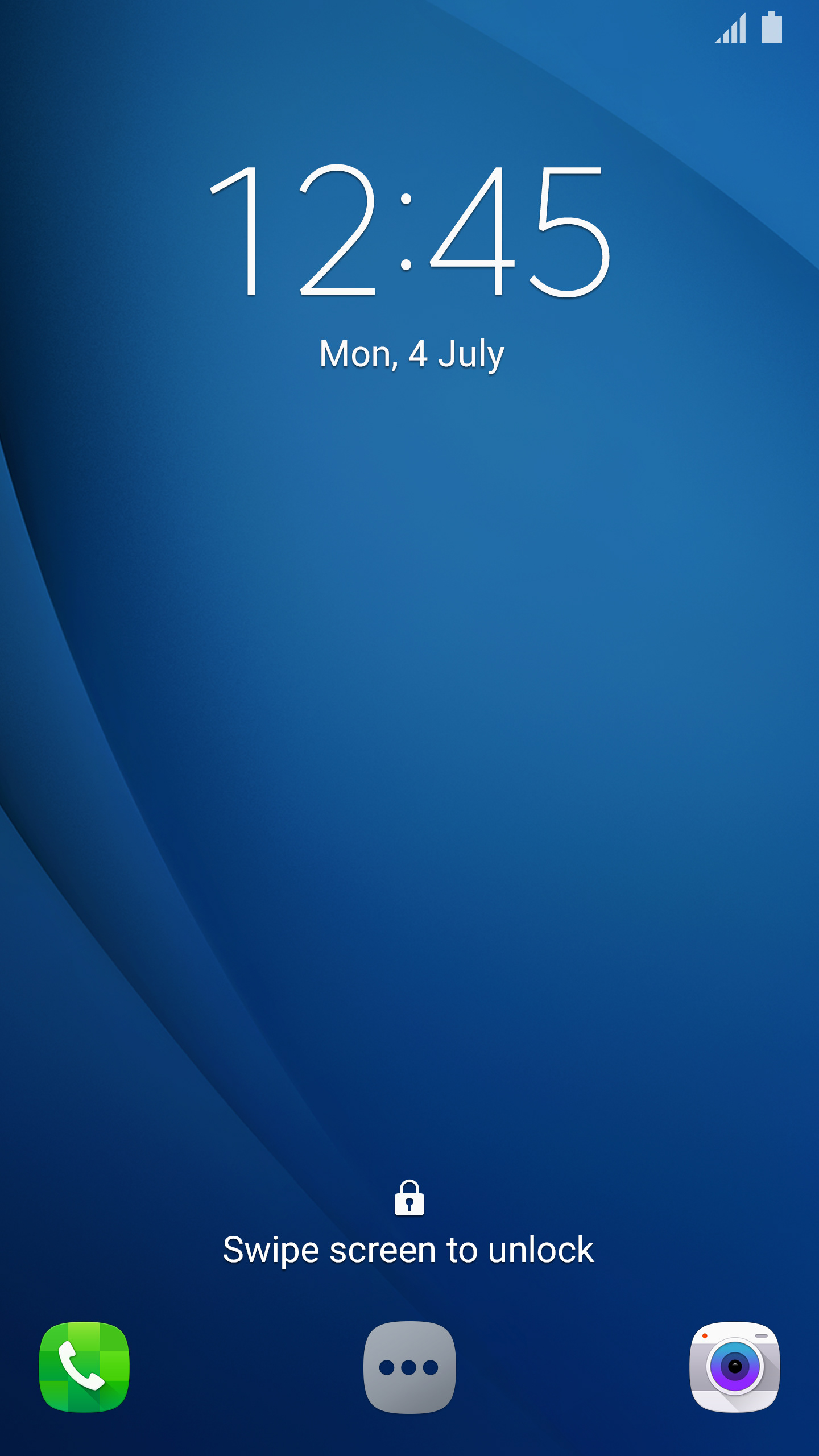
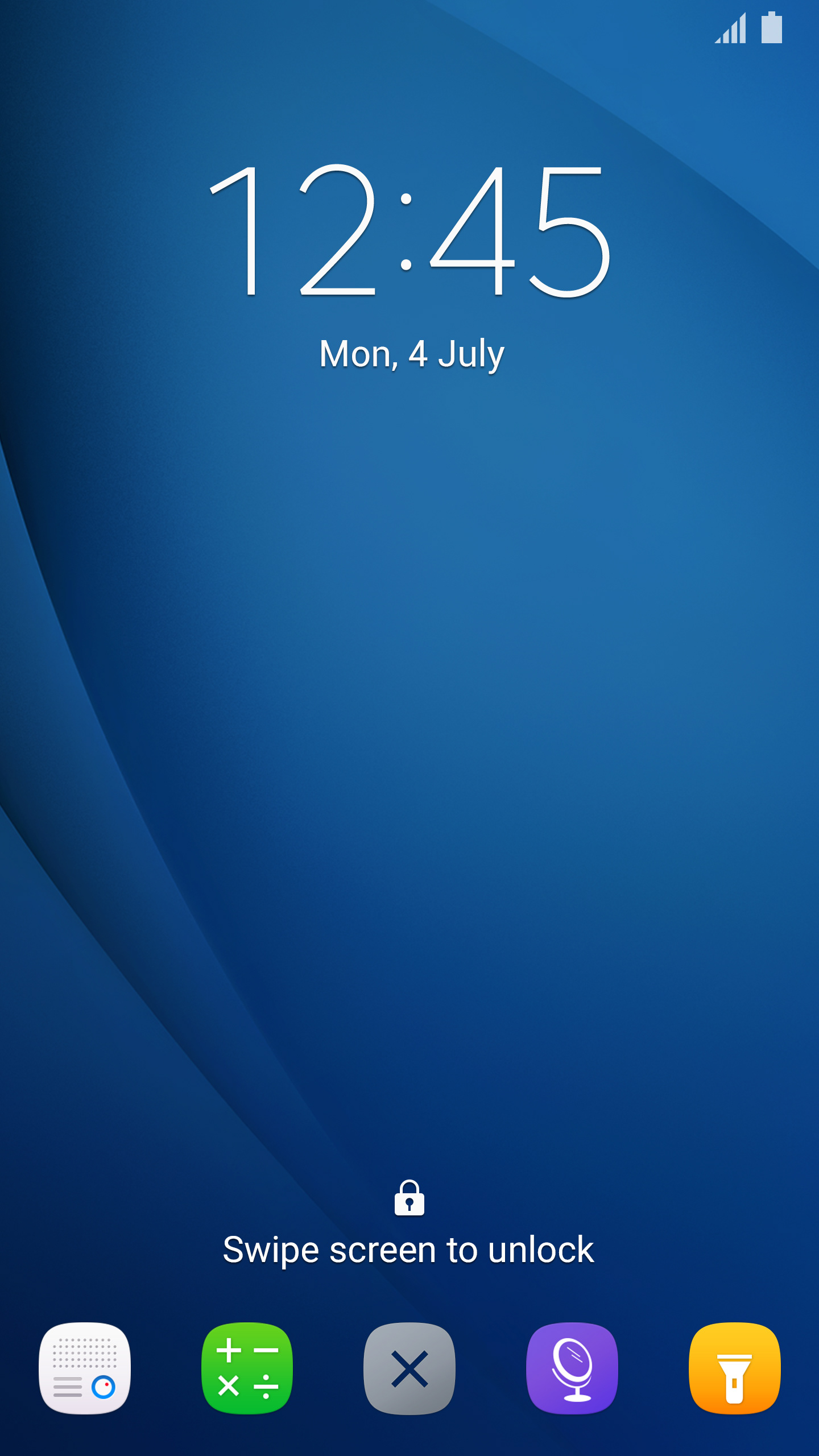
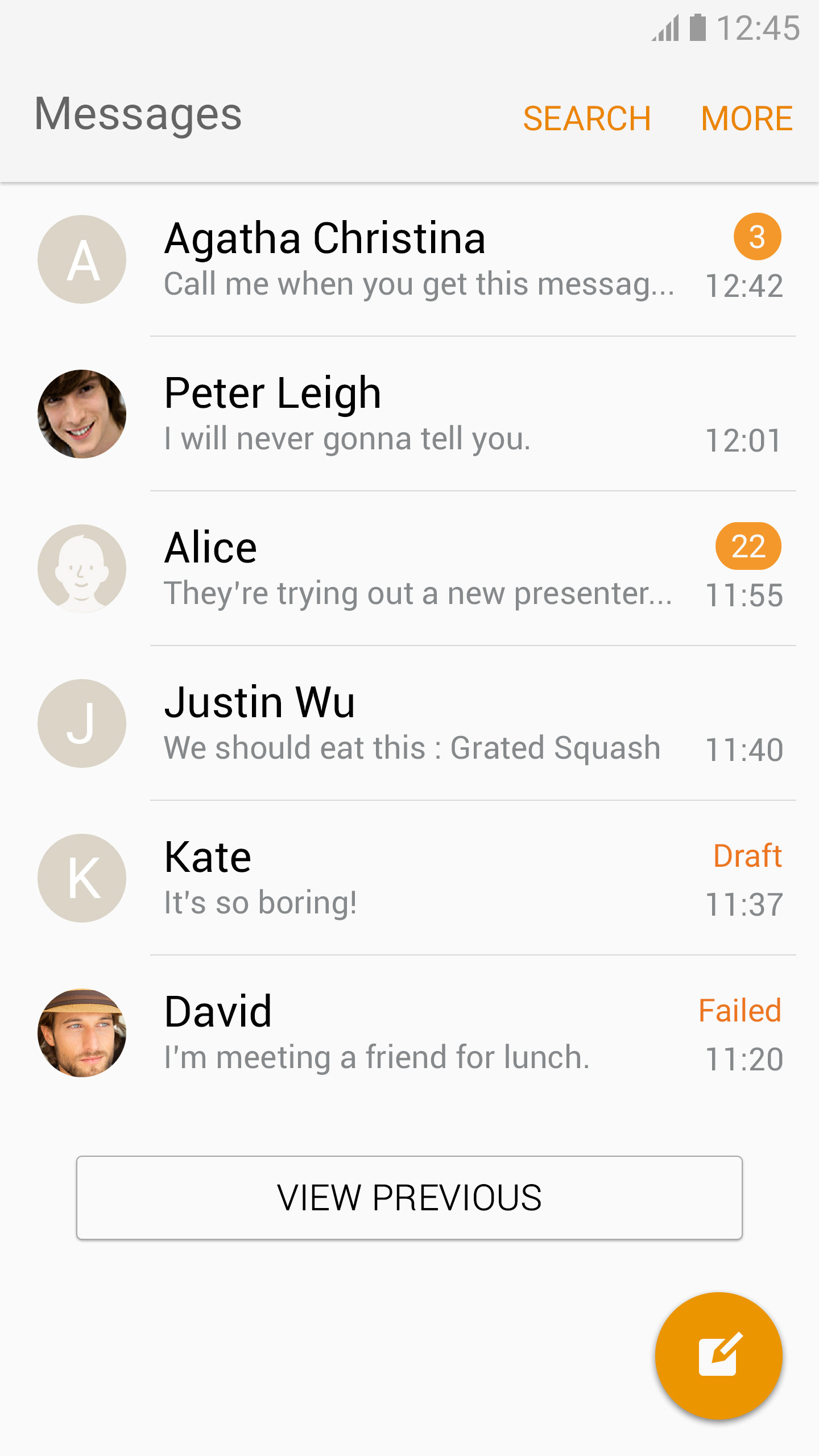
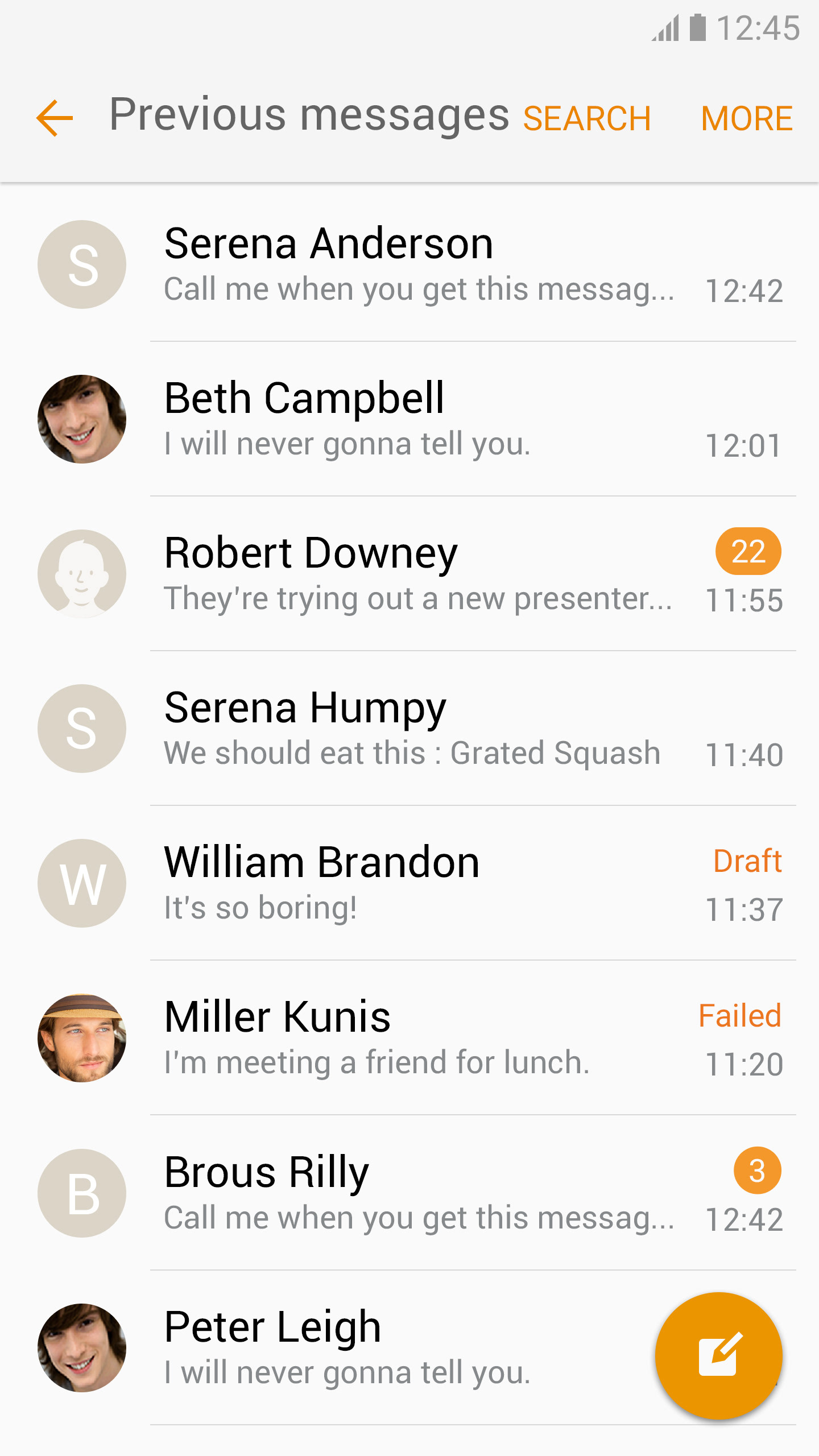


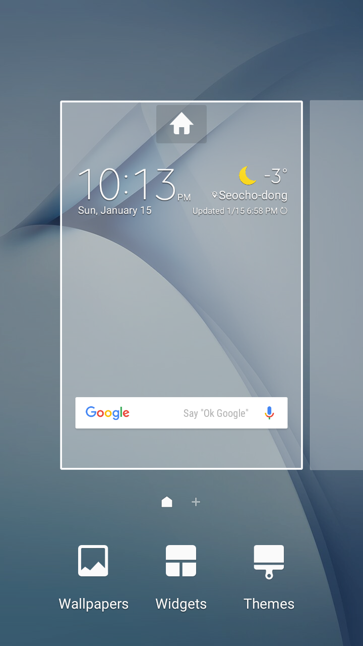
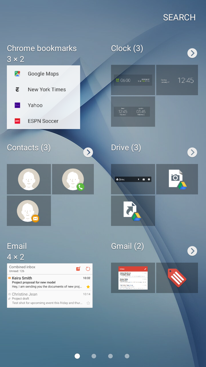
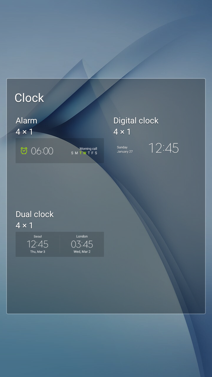
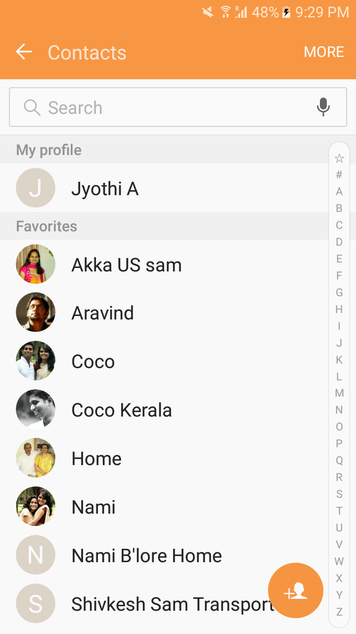
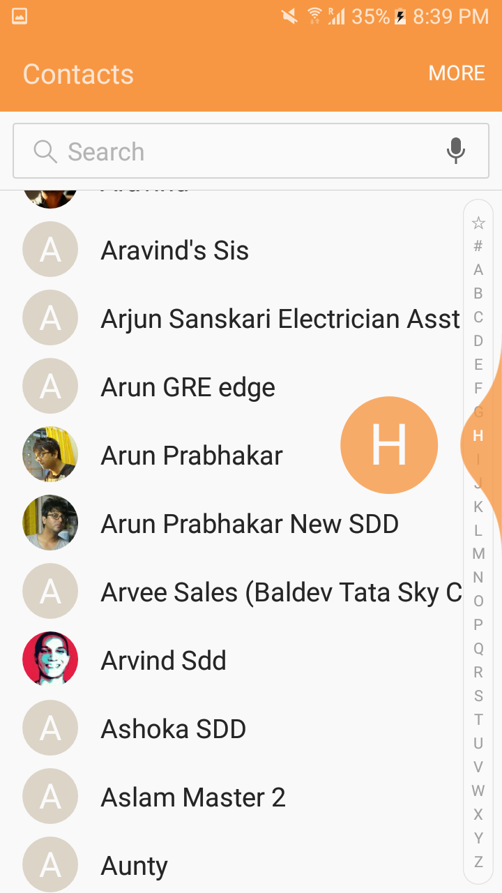
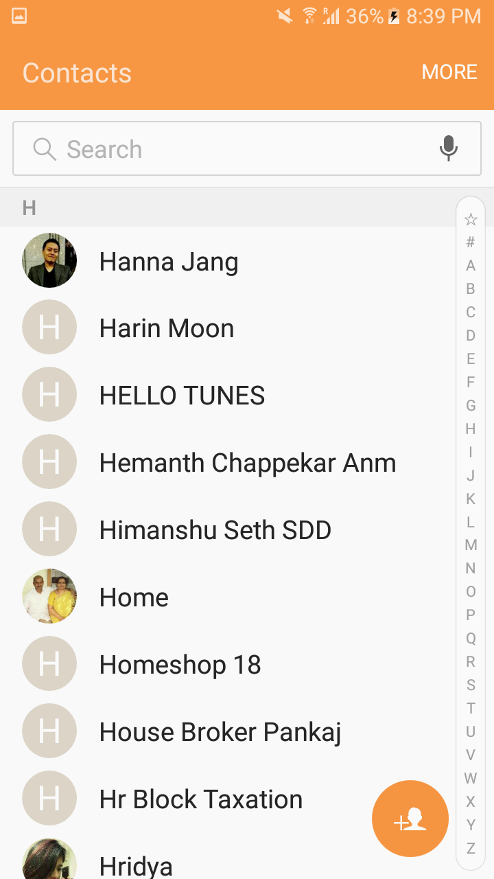
Modifications to the early design proposal of native apps based on testing and validation results.
Final Design
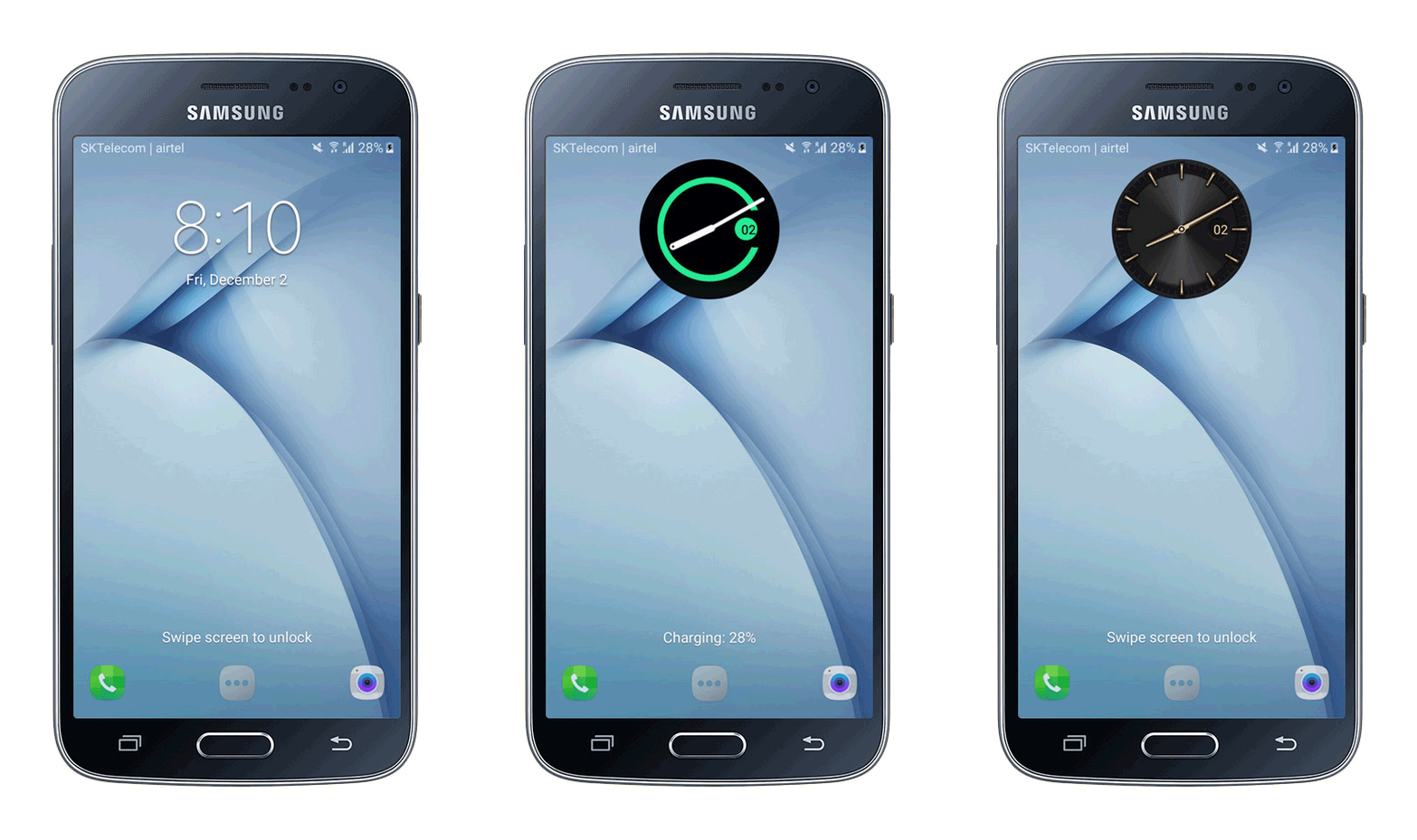
Feasibility to change the clock type by long press on the clock area
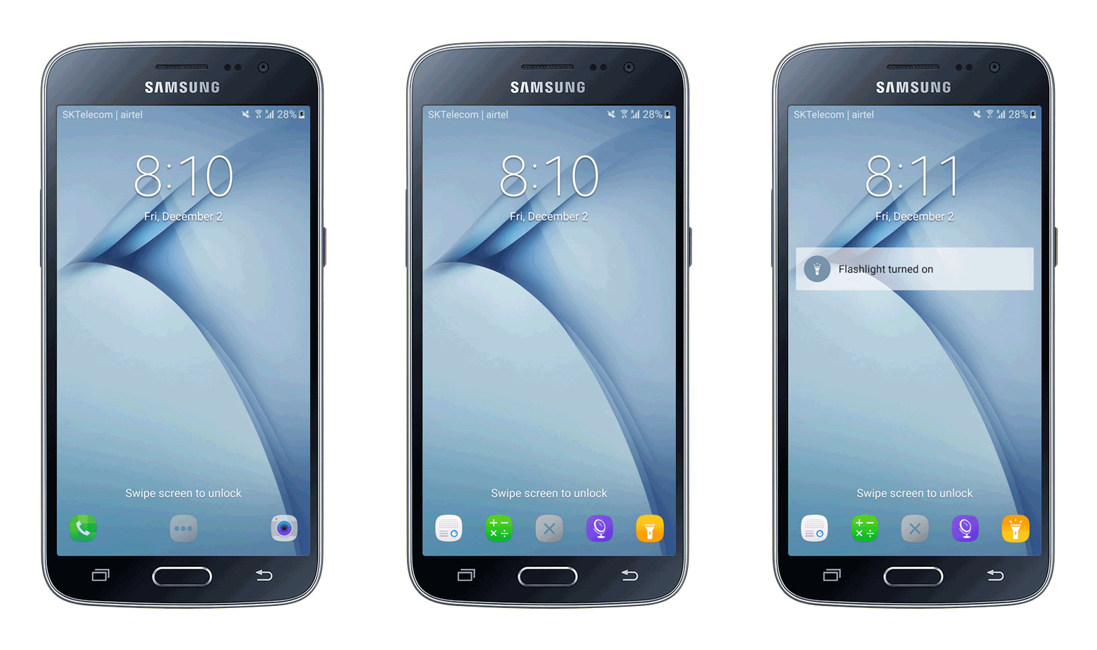
Access to flashlight from quick apps section

Mirror mode for those users who would like to have a quick glance of themselves without others noticing them
A glimpse of Lock screen behavior and access to Quick apps shortcuts.
The Impact
J2 was released in the market in July 2016. J2 gained popularity in the mass model segment, and over 2 million devices were sold within a few months of the release.
Performance results of J2 2016 as compared to the previous version of Galaxy J2
My learnings
Software performance is not just limited to hardware specs but learned how UX/UI and motion design impact and also play a key role. Also, re-designing the native app experience framework helped to learn and deep dive into core app experience design and how it serves as the major criteria for buying a phone.

